


 iskra_credentials_ru_pdf [3.9 MB]
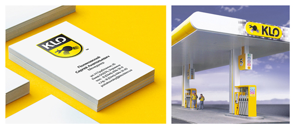
5 september 2013
New KLO by old ISKRA
This spring ISKRA creative agency finished the first stage of the complex rebranding campaign for the national network of gas stations, KLO. It's been one of the most significant projects for the agency, especially due to the fact, that more than 10 years ago KLO's identity has been developed by the agnecy's creators. At this moment, the agency keeps on working on the other 52 gas stations, marketing materials, and website.
The brief task was to refresh the identity of KLO according to its new business needs and new visual trends in branding.The consumer nowadays, according to marketing reserach, prefers a gas station to be a shopping center, a place for fun, restaurants and recreation at the same time. In addition to meeting these objectives, brand character needed to be more friendly, while maintaining its drive and awareness.
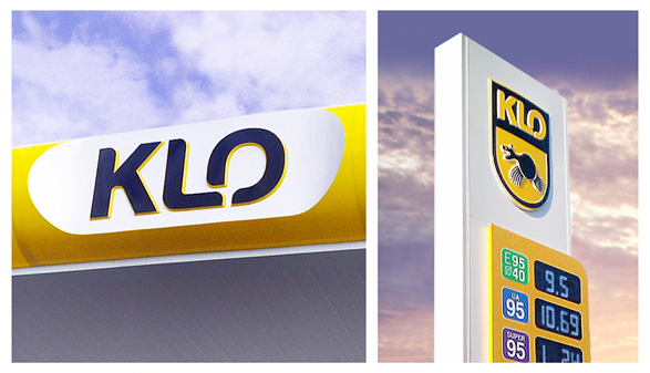
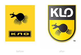
Bogdan Kravchenko, Creative Director of ISKRA: "The solution to the brief was complex rebranding campaign to upgrade image. We started with the Latin spelling of the brands' name, KLO. Firstly, it well corresponds to the status of KLO, well established company that works tp European standards for a long time. New font helped us to make easy transfusion of one letter into another. This is a beautiful visual metaphor that reflects the business nature of KLO. Klovets, the brand hero, has become more friendl y and visible in graphics, retaining its drive and mystery, so valuable by loyal customers. In logo block we used modern heraldic chevron for easy printing purposes. Also, we developed and implemented special identity pattern of squares in all architectural solutions of the gas station. Its rhythmic repetition gives it a special identity touch, filling the brand with such valuable attributes like speed and innovation, which is consistent with the philosophy of this innovative company and its brands.


